Not just visual style, but stronger presentation quality
A premium website should do more than look polished. It should explain the business clearly, guide people through the offer, and make the company feel more credible from the start.
This page is not just a gallery. It shows how we use structure, visual direction, and cleaner business presentation to make a company feel more trustworthy online.
A premium website should do more than look polished. It should explain the business clearly, guide people through the offer, and make the company feel more credible from the start.
Before a client speaks with you, the site already communicates quality, seriousness, professionalism, and trust. That is why structure and clarity matter just as much as design.
A stronger layout helps visitors understand the business faster and makes the company feel more serious from the first screen.
Color, spacing, typography, and hierarchy can immediately make a brand feel cleaner, more premium, and more established.
The best websites move people from attention to interest to action without friction, confusion, or weak calls to action.
Premium agency presentation
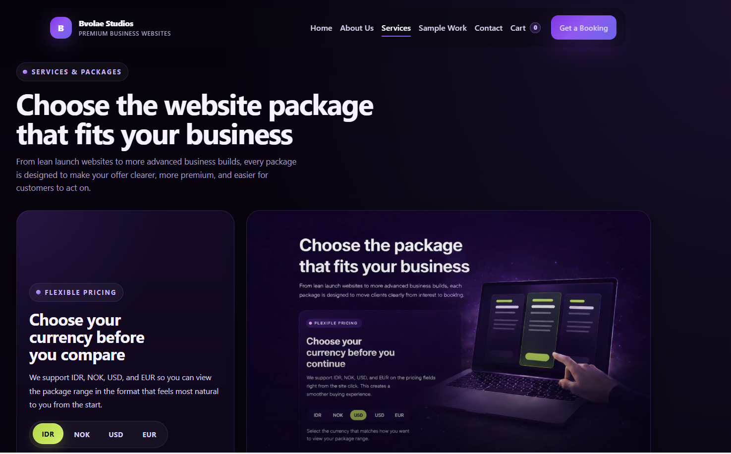
The main Bvolae Studios website with dark premium styling, structured service packages, booking flows, and a stronger digital brand presentation.
“Sharper structure, cleaner presentation, and a more premium first impression.”
Live site: bvolae.com
Warmer product presentation
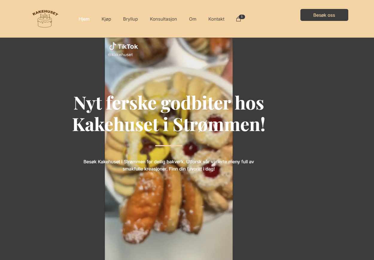
A bakery-focused website direction with product presentation, ordering logic, visual merchandising, and a warmer customer-facing experience.
“More product-focused, more inviting, and easier for customers to browse.”
Live site: kakehuset.com

A startup-oriented structure showing how we build modern landing pages with clearer offers, stronger call-to-actions, and more serious business presentation.
Clarity and conversion
A startup-oriented structure showing how we build modern landing pages with clearer offers, stronger call-to-actions, and more serious business presentation.
“Cleaner first screen, stronger messaging, and better conversion direction.”
Concept showcase
Bvolae Studios helps businesses build cleaner, stronger, and more premium websites that improve first impression, trust, and inquiry flow.